


.svg)


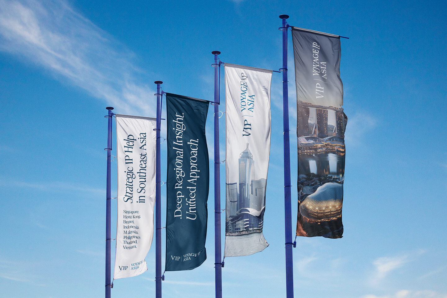
Voyage IP Asia may be newly established, but its footprint is already regional. From their bases in Singapore and Hong Kong, the team manages intellectual property matters across eight key Asian jurisdictions.
This multi-jurisdictional coverage positions them as a trusted partner for innovators who need clarity, consistency, and reliable protection across borders.
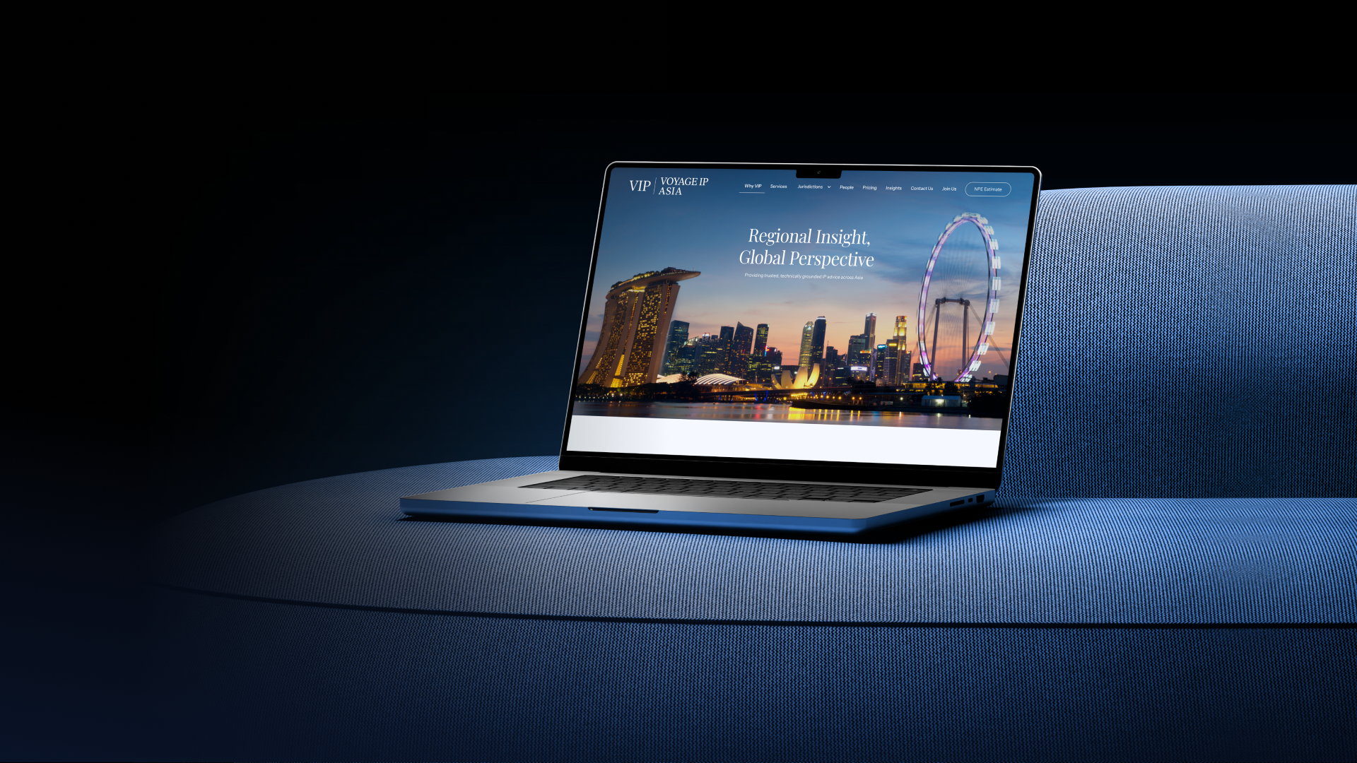
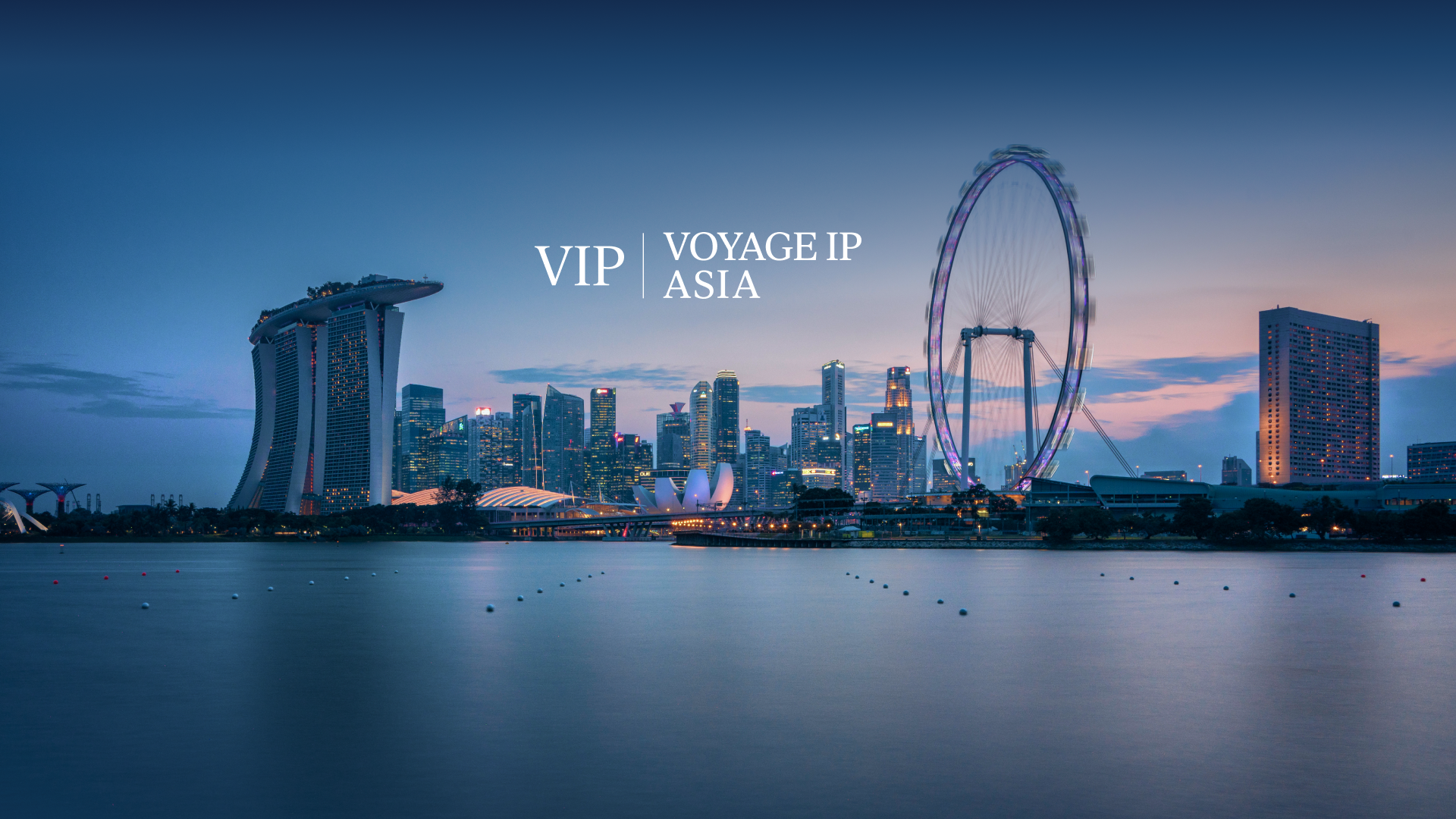
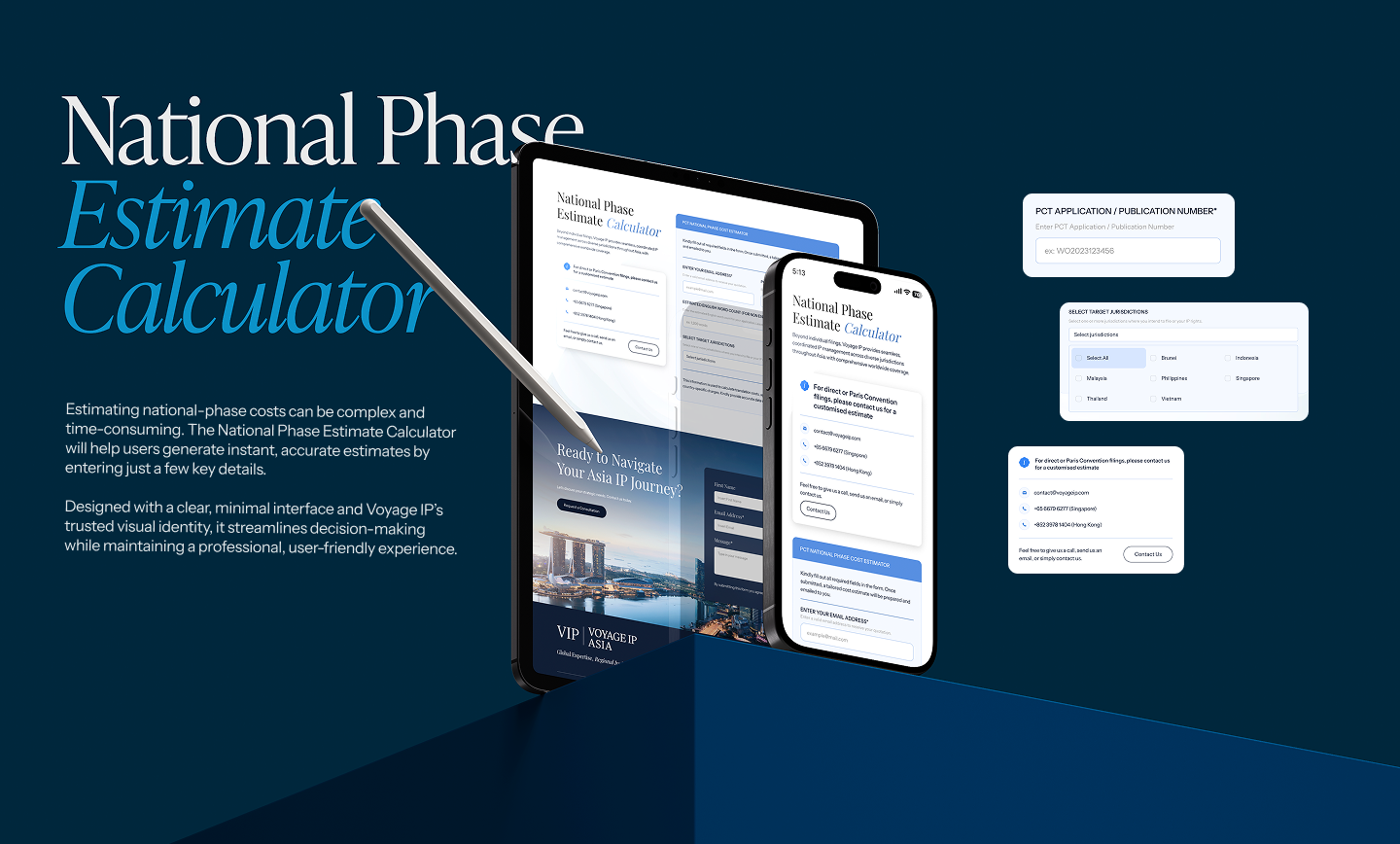
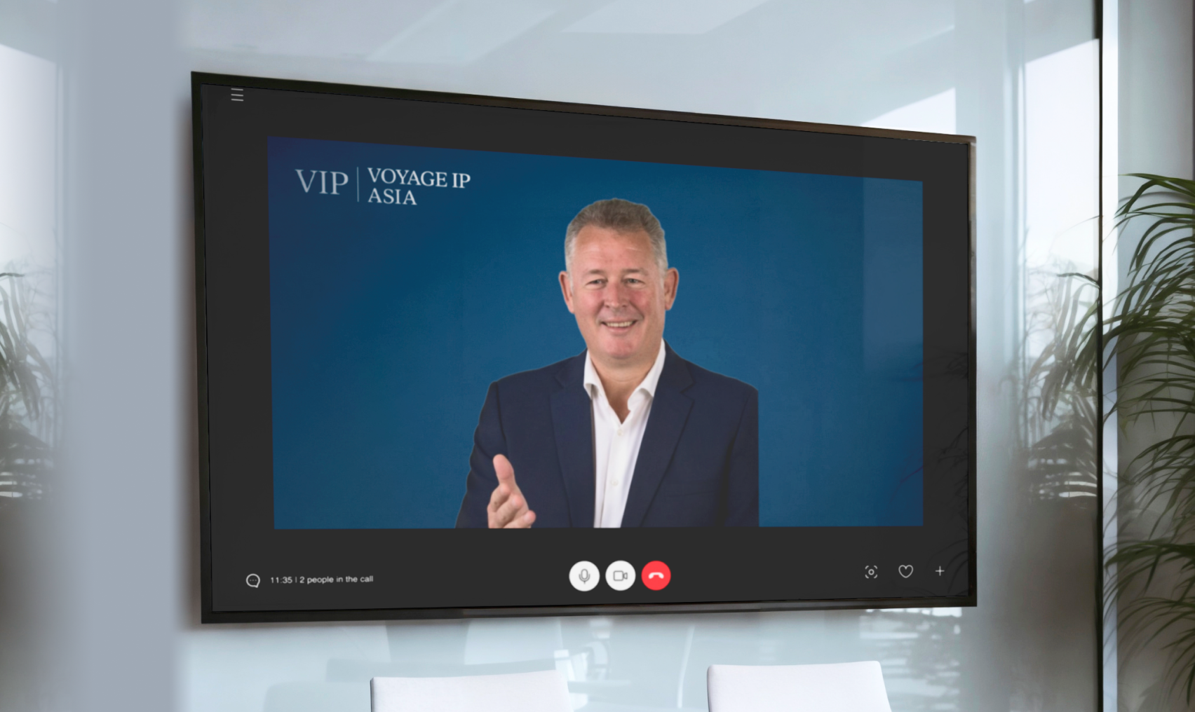
As a newly formed firm, Voyage IP Asia had no brand identity, no visual presence, and no digital platform. Their ambitions were high: they needed a brand and a website that would instantly communicate trust, domain expertise, and regional authority.
They needed to strike a balance: their look and feel had to reassure sophisticated clients (corporates, tech companies, inventors) that they were serious and credible, yet also be clear and accessible, not obscure or overly legalistic.


.png)
.png)
.png)

.png)
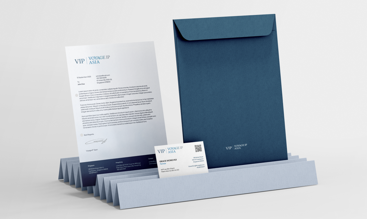
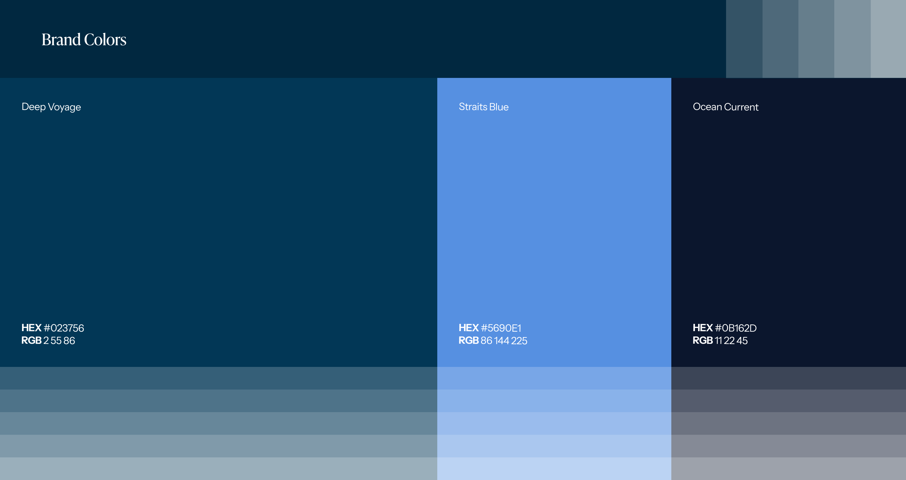
Typography played a central role in defining Voyage IP Asia’s voice. Ivy Presto Headline brings elegance and authority to titles, while Instrument Sans keeps the content clean, modern, and readable. Together, they balance credibility with approachability. Designed for responsiveness, the Voyage IP Asia website adapts seamlessly across devices, ensuring clarity, trust, and accessibility for clients on the go.


