

.svg)


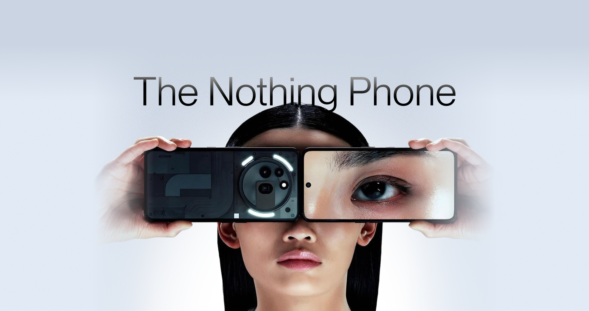
Nothing built its name on doing things differently. This time, with Phone (3), the brand is stepping into new territory. For some, this feels like a confident evolution. For others, it raises a question worth asking: is this bold progress or a signal that Nothing is drifting away from what made it stand out?
As a creative agency, we at Wondertabs do not just build brands that stand out. We also pay attention to those that already do.
The Origins of Nothing
Nothing was founded by Carl Pei, once co-founder of OnePlus, with one mission: break through the noise of a crowded smartphone market. The approach was clear from the start. The transparent back revealed the phone’s insides with nothing to hide. The Glyph Interface transformed notifications and charging into a mini light show. Combined with a price that balanced midrange cost and premium feel, it all made sense. It looked good and felt refreshingly honest.
Five years later, the third Nothing Phone has arrived. But this time, the reaction feels mixed. Some fans say the magic that made Nothing so different is getting harder to see.
How They Describe It
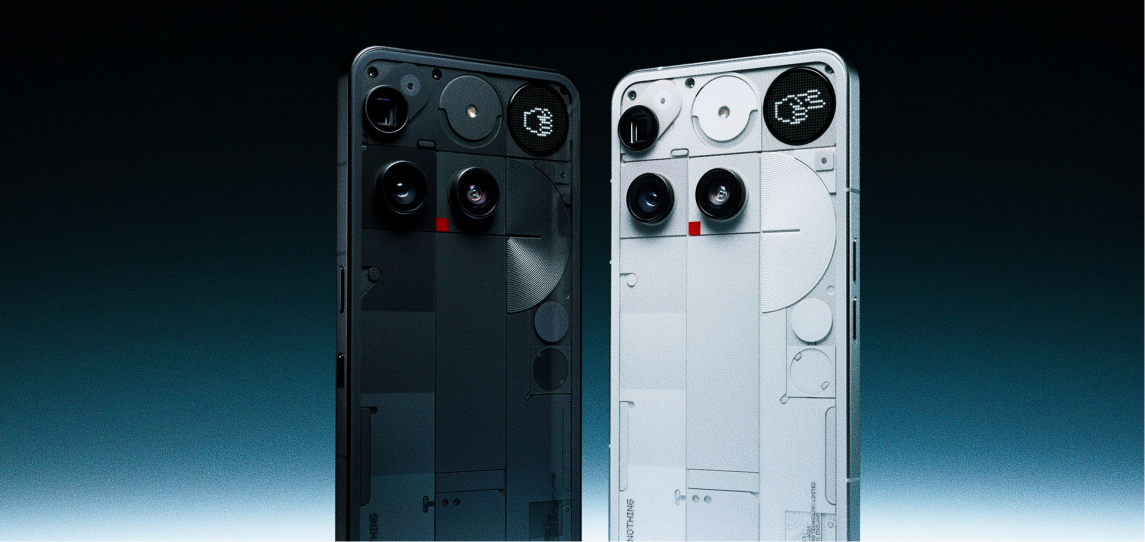
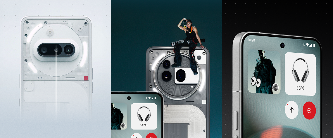
According to Nothing, the new Phone (3) is “a celebration of functional and intentional design.” Every curve, line, and material serves a purpose. The brand says this model blends technical warmth with striking simplicity. They call it “rationally harmonious,” an aesthetic that cuts through noise and shows a balance of style, craftsmanship, and durability.
They do not stop at words. They highlight specific improvements such as the ultra-thin 1.87mm bezels and a slimmer build, now eighteen percent slimmer than the Phone (2). From every side, the look is meant to feel lighter, balanced, and refined. In theory, these tweaks should elevate the phone’s comfort and appeal.
How the Public Describes It
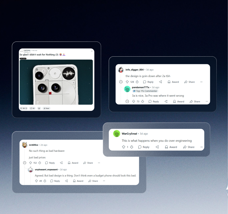
While Nothing’s story for Phone (3) sounds thoughtful, the public’s take is more skeptical. Some early fans are saying, “It looks like they have abandoned their own design language.” The bold transparent back? Now less pronounced. The playful Glyph lights? Rearranged into a quieter pattern.
At $799, Nothing now stands on the same shelf as flagship phones from bigger brands. But online, users are asking if the changes justify that leap. Some comments show disappointment that the hardware no longer feels as daring as the original promise. Others question whether the phone’s visual impact has lost its spark.
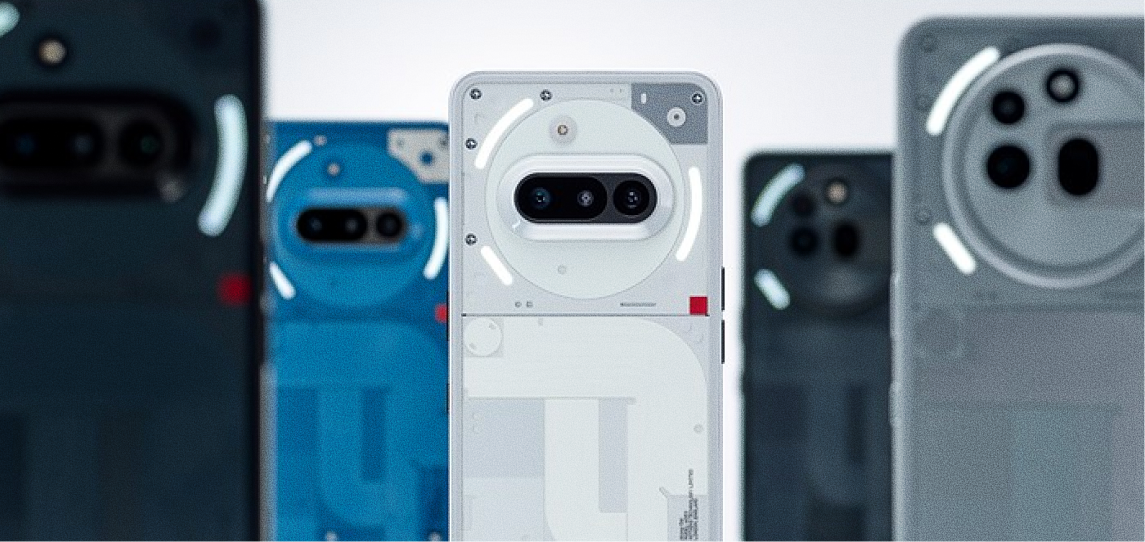
Breaking Down the Design
Intentional design has always been Nothing’s headline. But when you look closer, the choices this time raise fair questions. The off-center camera creates a subtle visual weight that pulls the eye off balance. Balance matters in product design. It guides the hand and the eye, bringing a sense of calm. When that flow is broken, it feels awkward even if you cannot explain why.
The Glyph Matrix, which once stole the spotlight with its light show, is now smaller and more restrained. In exchange for a more mature feel, some say it sacrifices the bold character that helped Nothing capture attention in the first place. Even the new curvier edges trade the sharp, flat vibe for something that feels more familiar.
Each adjustment makes sense on its own. Together, they add up to a design that feels more settled but perhaps a little less fearless.
The Design Principles
Symmetry and balance are not just nice to have in design. They are core to how people process what they see and how comfortable they feel using it. Our brains naturally seek order. When lines and shapes are balanced, they create a sense of harmony and stability. This makes products feel trustworthy, clean, and satisfying to hold.
When that balance is off, a design can feel awkward or distracting without us realising it. Brands rely on strong visual balance to keep an identity clear and consistent. It connects with people in a way they do not always notice but always feel.
Nothing’s earlier designs leaned on this balance. Now that the choices have shifted, the question is how much the phone’s charm depends on it.
Design Shift or Brand Drift?
Nothing built its following by rejecting what everyone else was doing. They made the inside visible, turned lights into a statement, and gave minimalism a raw edge. Phone (3) feels like a step into new territory. But is it a step forward into maturity or a small drift away from what made Nothing bold in the first place?
At Wondertabs, we stay curious. We watch these shifts closely because they remind us how even small design choices can signal bigger changes. This is not just about hardware. It is about what makes a product feel different when you hold it in your hand.
What do you think? Is this a smart next chapter or a sign that Nothing is becoming just another phone on the shelf?